


5 simple ways to improve your photos in Lightroom
- WildWillowWays

- Sep 28, 2020
- 6 min read
Updated: Jun 23, 2021
This is not an expert guide to Lightroom, nor is it even a beginner’s guide. There are many online guides produced by those who are more knowledgeable about Lightroom than I am. This blog is simply a sharing of tips that I have picked up and would like to pass on. While I have a lot still to learn about all that Lightroom has to offer, and am not yet delving into its advanced tools, what I am describing here are 5 steps that I use on a regular basis and that always enhance my photos to some degree.
Apart from using the native phone camera editing function or an app such as Snapseed for phone camera editing, I usually do post processing in Lightroom. As well as realising that images are always better when they undergo a bit of ‘development’ in the digital darkroom, I also enjoy the creative process of trying to achieve in my final image the vision that I had while shooting, The camera does not immediately show you all the detail that it has captured, it just presents its basic image and editing helps you to bring out the detail. While I enjoy the creative aspect of this side of photography, I am by no means knowledgeable in this program and am continually learning more about the features of Lightroom so that I can get the best out of it. For now, I have familiarised myself with basic adjustments and I enjoy revealing the detail in an image that suddenly makes the image pop.
#1 White Balance
The first thing I do with each photo once I import it into Lightroom and bring it into the Develop mode is to check and adjust the white balance. Although in most cases, particularly in higher end cameras. the camera auto white balance setting does a decent job of getting accurate colours in images, it does not always work out correctly. Since the camera doesn’t see as we do I often feel that our eyes are best at determining what colours should look like, so if you are not pleased with the colours out of camera you can adjust the white balance. You want to get the whites and greys looking as neutral as possible. You can do this by eye using the Temp and Tint sliders in the basic panel or by using the white balance selector tool. This tool is the dropper tool on the left side of the basic panel.
TIP: Often our eye is the best judge of how the colours in our images should look. Use your eye to help you determine what is pleasing to you.


#2 Crop and straighten
Although I make every effort to get my horizon straight in landscape photos, or to ensure that buildings don’t look slanted, I don’t always succeed so this tool does a good job of straightening the image and cropping slightly if there is any unwanted distraction on the edges of the frame.
TIP: There are different options for cropping. If you are not intending to print your images a free crop is sufficient but for printing images it is better to opt for a standard size crop.


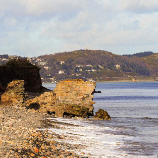
This image looks better cropped
#3 Basic Panel
This is where most of the basic editing happens. The first thing I do in the basic panel is check the exposure of my image. While nothing will save a very badly exposed image, an image that appears to be slightly too bright or slightly too dark can be adjusted by using the exposure slider. You can adjust the contrast here also, which is worth doing to most images but is easy to overdo also. Other sliders in the basic panel can adjust whites and highlights, blacks and shadows. Reducing highlights and bringing up shadows reveals a lot of detail in a photo, but the sliders can be adjusted in numerous ways until you achieve the effect you require. Further down in the panel are the clarity, vibrance and saturation sliders. I usually make only slight adjustments with these sliders and I favour vibrance over saturation as it helps to bring up colours that are not very vibrant whereas saturation affects all colours, even those that are already vibrant.
TIP: The letter “Y” is a shortcut key to show before and after images, which is useful to compare as you go along. Doing this often helps me to see if I am beginning to over edit my image.
#4 Tone Curve
While the exposure slider adjusts the exposure of the whole image at once, curves allows you to adjust lights, darks and mid tones separately. When you hover over the tone curve with your mouse you will see which part of the graph that part represents. It is divided into four parts – highlights (the lightest part of an image), lights, darks and shadows (the darkest part of an image). Adjusting the tone curve creates contrast between the tones. This can work well on a sky, for example.


I used only tone curves to brighten this image
TIP: I didn’t find curves easy to use initially but it is worth taking time to explore this option to see how it affects your image. Once you master curves you will find it to be a useful tool to quickly enhance your image. You will find a good tutorial on using tone curve here.
#5 Hue, Saturation, Luminance (HSL)
After making basic adjustments I sometimes look to these tools to enhance and fine tune the individual colours in my image. Instead of adjusting everything at once, as in the basic panel, the HSL panel allows you to work on one colour at a time and adjust the hue, saturation and luminance of each colour separately. Each option in this panel has a different function. Hue, as the name suggests, changes the shade of the colour, for example you could change red to pink by moving the slider in one direction. Saturation boosts or tones down the colour, while luminance adjusts how light or dark to make the colour. If you choose the All option you can, for example, pick one colour and adjust hue, saturation and luminance together. This is a good option if there is a prominent colour in your image that you want to adjust with all three sliders. It is well worth spending some time exploring this panel as it can make a significant difference to some shots.
TIP: This panel is great for converting a colour photo to black and white as you can use the saturation sliders to take away each colour and see which ones have impact on the image. You can use luminance to adjust the impact of tones. This results in a black and white image with good contrast, especially an image which has a lot of similar tones. When I started to explore the saturation and luminance sliders, I began to appreciate how a black and white photo is more than just a colour photo with the saturation removed.


Below are some images. The image on the bottom has been edited to some degree and I have included edit details below the image.

I brought down the highlights here and adjusted the yellow in the HSL panel


My eye saw my cat silhouetted against the sky, but the camera image didn’t quite turn out as I had intended so I pulled down the shadow slider in Lightroom to create the silhouette. I also cropped the image slightly to reposition the cat.


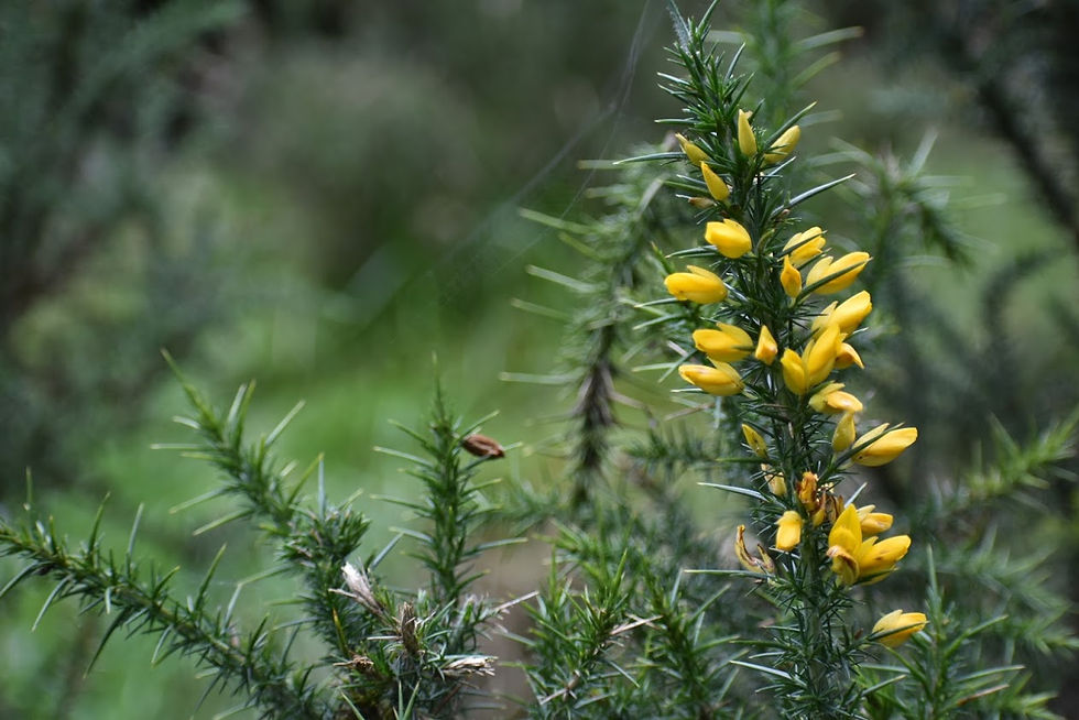
My main adjustments here were to the yellow and green in the HSL panel.
There are many more advanced editing tools offered by Lightroom, many of which will result in even greater enhancements, but for now I tend to leave those to the experts. The biggest problem for me in using post-production software is the temptation to over process, which will not look well, so I tend to go easy with post processing. However, I still think that a little work on images can make a big difference. Not only that, but it is also an enjoyable, creative, even an addictive part of the craft of photography. In my opinion, photography as an art form would be much poorer without image processing.
Further reading
I hope this post has given you some reasons to consider post -processing, and maybe a few ideas to help you get started. If you would like further information on using Lightroom, I recommend the following articles:
https://photographylife.com/post-processing-tips-for-beginners (This is a comprehensive guide which is divided into easily accessible units. For example, clicking on how to use the basic panel brings you directly to that tutorial)
Creative live ultimate guide to post processing


Comments